Some of us who blog get mildly preoccupied with our UI (user interface) — the sidebars, pulldown menus, ad placement, etc. The best UI has just what you need right where you need it. Building a UI requires an intuitive understanding of how people will actually use the end product.
I think it’s cool when a piece of gear demonstrates a clever, subtle understanding of UI design. Most gear hits the obvious marks: straps to hold ice axes, little nets inside a tent to hold your glasses and watch, etc. But sometimes they hit an unexpected mark that just makes me smile.

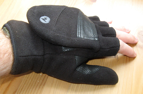
Case in point: these convertible glove/mittens from Marmot. They have a flap that folds back so I can take pictures on my winter hikes. But here’s the cool point: when you pull the mitten section back, a magnet snugs it in place. Could be done with snaps or Velcro, but this is much more elegant approach.
There are countless more examples of clever, elegant UI design in outdoor gear. Please leave a comment if any spring to mind.
Editing to add: Thanks to a couple of you who reminded me of the shenanigans the magnet will do with a compass. I checked with my little hand compass and sure enough, the magnets made the needle dance something fierce. It’s notable enough you’d have to notice something was amiss.

Those who navigate with map and compass should be very careful about gear with magnets in them. Could lead to some fun and games in the field!
Got the same comment on the twitter feed so I checked — the needle goes straight to the area where the magnet is; I wouldn’t have thought the magnet was that powerful.